
Typography and Font Best Practices for Inkjet


Though it may be an overlooked component in the recipe for high-quality inkjet print, the choices you make with the typography in your design plays an important part in determining the success of your project.
“Color, clarity, imagery, and typography all play a part in quality print production,” write Elizabeth Gooding and Mary Schilling, authors of The Designer’s Guide to Inkjet, 3rd Edition. “For inkjet, the way a pixel or dot of ink is delivered to the page can affect all those parts.”
In fact, understanding and designing with best practices for typography in mind is just as critical as your choice of substrate or ink in producing print with superior quality text that is easy to read and adds to the aesthetic value or motif of your project.
With this in mind, let’s look at what you should know about best practices in typography and font for inkjet to help you design exceptional quality print that leaves a lasting impression on your audience.

What to know about typography when designing for inkjet
The quality of print shows itself quickly when you look at the legibility of the text. Because ink is absorbed differently based on the nature of the substrate — coated, uncoated, or digital treated — one dot of ink can spread a little or a lot, and the degree of dot gain can significantly affect the legibility of text, particularly when it comes to small or fine text.
“Text at 4, 6, 8, or even 10 points can be unreadable with certain ink and media combinations,” write Gooding and Schilling.
As such, designers should always use positive type for long passages or blocks of text as opposed to inverse type — also known as reverse text — because inverse type, when printed with more aqueous inks like those used with inkjet, can be visually challenging to read.
According to Gooding and Schilling, inverse type is more ideal for “headline or callout copy that is larger than 14 points for serif and 12 points for sans serif fonts.”
This means designers need to understand the right minimum sizes for inverse text in order to maintain adequate spacing, and to also help ensure legibility by allowing for dot spread and absorption into the substrate.
When accounting for dot spread and legibility of text with inkjet print, designers have a couple of key strategic moves at their disposal: kerning and leading. Kerning refers to the adjustment of the space between the letters in a line or within a block of type, whereas leading addresses the space between lines of type as measured from baseline to baseline.
These adjustments to your typography can be used to open solid body copy and reverse copy to increase the legibility of your text and better compensate for dot gain.
“Adding kerning gives a sense of airiness and openness between the letters but will increase the space needed for the text block,” explain Gooding and Schilling. “When printing with uncoated or treated media, adjusting the kerning helps to better define the letters and improve clarity.”
With leading, Gooding and Schilling explain that looser leading creates more space above and below each line of text and makes the document easier to read, but looser leading can require more dedicated space for the text block.

What to know about font when designing for inkjet
One of the most important elements when designing for inkjet is font color, and how your use of color can impact the legibility and overall quality of your project. While using color in your copy can add a little something extra to your design, it can present some challenges — though we should note that even sticking with black font color is not necessarily as cut-and-dry as it seems.
For example, even with black copy, many designers like to use color to create a rich black for a darker, denser black color. The complication with rich blacks for inkjet print is that they can cause media saturation, text raggedness, and possible registration issues for very small or fine text.
“When designing for inkjet, rich blacks should never be assigned to body copy,” write Gooding and Schilling. “Overall, it is safer to specify black as 100 percent K instead of rich black for inkjet devices. And it should go without saying — never make text or any document color with RGB. Black created in RGB will automatically convert to rick black.”
If you do require rich blacks for certain instances, Gooding and Schilling recommend you include a sample of your printed reference chart when preparing and sending your design files to your printer, as some inkjet presses can print enhanced black inks designed for books and other text-centric applications.
Closely related to your choice of font color when designing for digital inkjet is accounting for the minimum line weights of your design. Solid and reverse line weights are another design component affected by dot gain, and some ink color and media combinations can cause solid lines to widen and spread depending on the kind of substrate.
Lines printed on uncoated stocks with a single process color should use a line setting of 0.375 or higher, while reverse lines should be 0.75 or higher when printed on uncoated stocks. While these recommendations are based on fairly exhaustive testing and real-world use, Gooding and Schilling do advise running your own samples on your target press for a better understanding of your specific print parameters.
With these typography and font best practices in place, you’ll be able to design higher quality inkjet print. But there’s more to the typography and font conversation for inkjet than what we’ve covered here. Download The Designer’s Guide to Inkjet, 3rd Edition to learn more about these and other design considerations for inkjet print.
See More Like This
See More
Marketing Collateral
Project Spotlight: A Practical Giveaway to Keep thINK Ahead Attendees Cool
Marketing Collateral
Project Spotlight: A Blank Canvas for Organization and Inspiration
Marketing Collateral
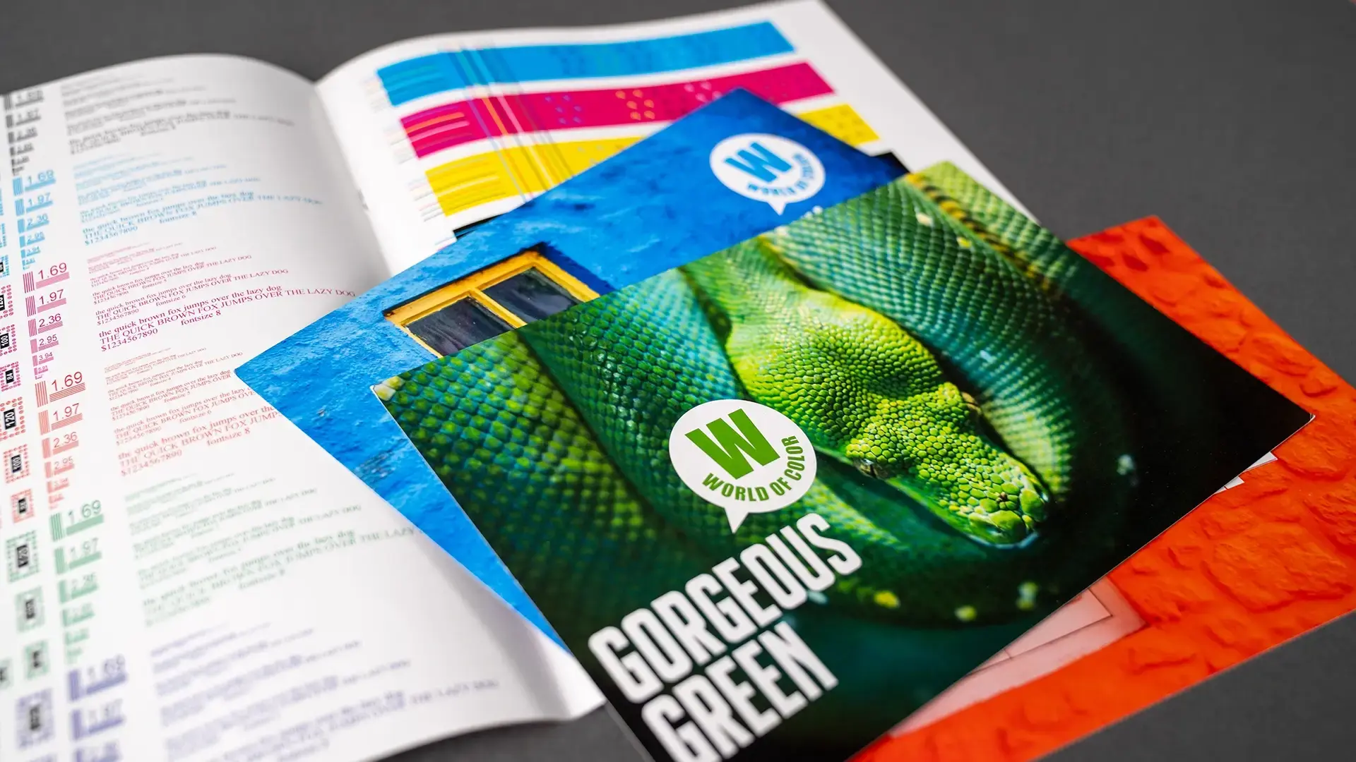
Project Spotlight: Exploring the Wide World of Color
Marketing Collateral
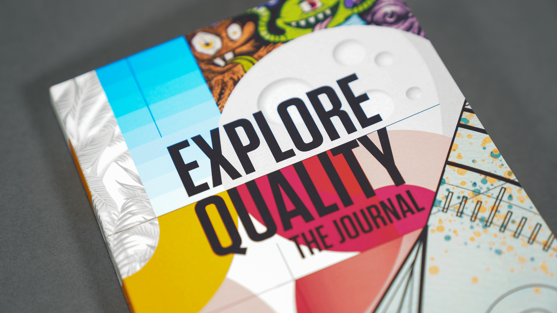
Project Spotlight: A Planner and Journal for Exploration and Discovery