How the Paper You Choose Affects Your Color Gamut


Like so many other aspects of the print process, the relationship between ink, paper and press has a significant impact on the color and image quality of your project. This relationship is perhaps no more apparent with how the type of paper and press affects the ability to print a broad, dynamic color gamut.
The term color gamut — also referred to as color space — refers to the range of colors that a device can display or print — in The Designer’s Guide to Inkjet, 3rd Edition, authors Elizabeth Gooding and Mary Schilling connect the idea of color gamut to that “of each device having a different number of colored crayons in its box.”
Some paper and press combinations can reduce the color space you can achieve, which can also result in a significant difference between how colors appear on a screen during the design and proofing process compared with how they actually appear in print.
With this in mind, let’s briefly break down how color spaces (gamuts) translate from the device display to the page, and how the type of paper you choose can affect your color gamut.

Display color versus print color: What’s the deal?
The monitor of your device uses a specific type of profile to display a standard printing color space. This profile allows the Red, Green and Blue (RGB) color space of your monitor to render the Cyan, Magenta, Yellow and Black (CMYK) values you visibly choose on your monitor, thus simulating the color space of the press you’re designing for.
Because your monitor projects light, you see the image or color on the monitor based solely on the colors that are projected back to your eyes. Gooding and Schilling describe these as additive colors because more color can be added to enhance the color space if what’s there is not adequate.
Opposite of additive colors are subtractive colors, which are foundational to CMYK printing processes. CMYK inks filter the light your eyes perceive, leaving behind only the light reflecting off the page. Unlike additive colors, subtractive colors don’t allow you to add color to increase the intensity.
“The CMYK color space is a smaller subset of colors that fit into the RGB space,” explains Gooding and Schilling. “The CMYK printing process will never accurately print the entire RGB color space. This can create a big difference between what we see on the monitor, your desktop proofer, and the actual printed piece produced from any of the current CMYK printing processes we use today.”
This begs the question: What if the color space you have designed in — that of the monitor — is larger than that of your printing equipment? Essentially, it’s akin to baking a cake without having all the ingredients.
Out-of-gamut colors are those used in a design file that cannot be accurately produced by the kind of press you’re printing on — regardless of whether it’s an inkjet press or a more conventional offset device.
“This is especially true for PMS spot colors, which are created with a palette of fourteen base colors, plus white,” writes Gooding and Schilling. “Out of Pantone’s full swatch color library, 1,114 cannot be reproduced accurately by the offset CMYK combination. That’s many more crayons than the ones that come with the typical inkjet box”

The place of paper in color gamut?
While controlling your design-to-print color expectations begins with how color is produced on a monitor and reproduced by a press, the kind of sheet you’re printing on is critical to ensure you get
an accurate reproduction of your colors, images and design. As such, designers need to first consider these higher-level concerns of paper choice:
-
Paper whiteness
-
Paper brightness
-
Colored or uncolored sheets
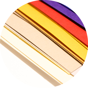
As you would expect, the type of ink and paper you use — uncoated, coated or treated — also weighs heavily on the range of color you can achieve, and how closely the color on your monitor will match the color on the page. It also impacts how many out-of-gamut colors you may encounter during the design file transfer and proofing process.
Here’s a quick, handy overview of the range or breadth of color gamut you can achieve with each of these paper stocks:
-
Uncoated paper: Because uncoated paper does not have any surface treatment, the sheet allows for more absorption of colorant into the fiber during the printing process. The more ink that is able penetrate the paper, the less crisp and sharp the colors will be, and this will also decrease the color reflection. As a result, uncoated papers print images that are duller and have a smaller color gamut compared to other sheets.
-
Inkjet treated paper: Inkjet treated papers are specifically formulated for more aqueous inks, and the surface treatment of inkjet treated sheets makes it easier for the colorant to separate from the carrier liquid. As such, the porosity of inkjet treated paper is much lower, which also reduces the amount of ink necessary to produce vibrant colors and images. According to Gooding and Schilling, inkjet treated sheets offer a better result in terms of color clarity and gamut.
-
Inkjet coated paper: Inkjet coated paper features a unique coating that allows ink to dry extremely quickly, much more so than inkjet treated, and certainly much faster than uncoated sheets. This fast drying surface limits the amount of ink that can be absorbed into the fibers, and it also helps inkjet coated sheets reproduce the broadest color gamut with the most brilliant, accurate reproduction of the RGB to CMYK print process.
This understanding of the relationship between the color on the monitor and the color on the page can help you execute the highest quality print possible, but there’s still so much to know about the nuances of designing for inkjet. Download The Designer’s Guide to Inkjet, 3rd Edition to take your print to the next level.
See More Like This
See More
Marketing Collateral
Project Spotlight: A Practical Giveaway to Keep thINK Ahead Attendees Cool

Marketing Collateral
Project Spotlight: A Blank Canvas for Organization and Inspiration
Marketing Collateral
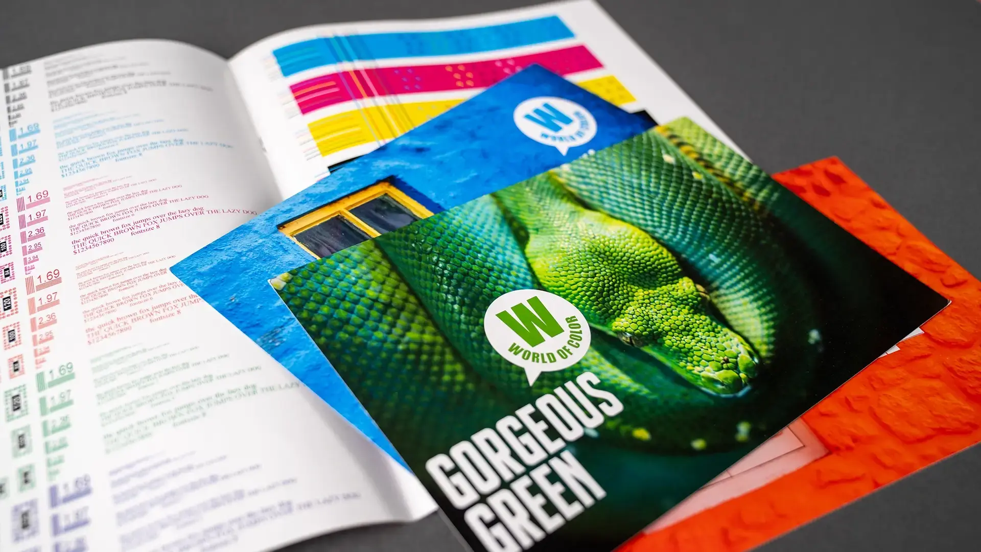
Project Spotlight: Exploring the Wide World of Color
Marketing Collateral
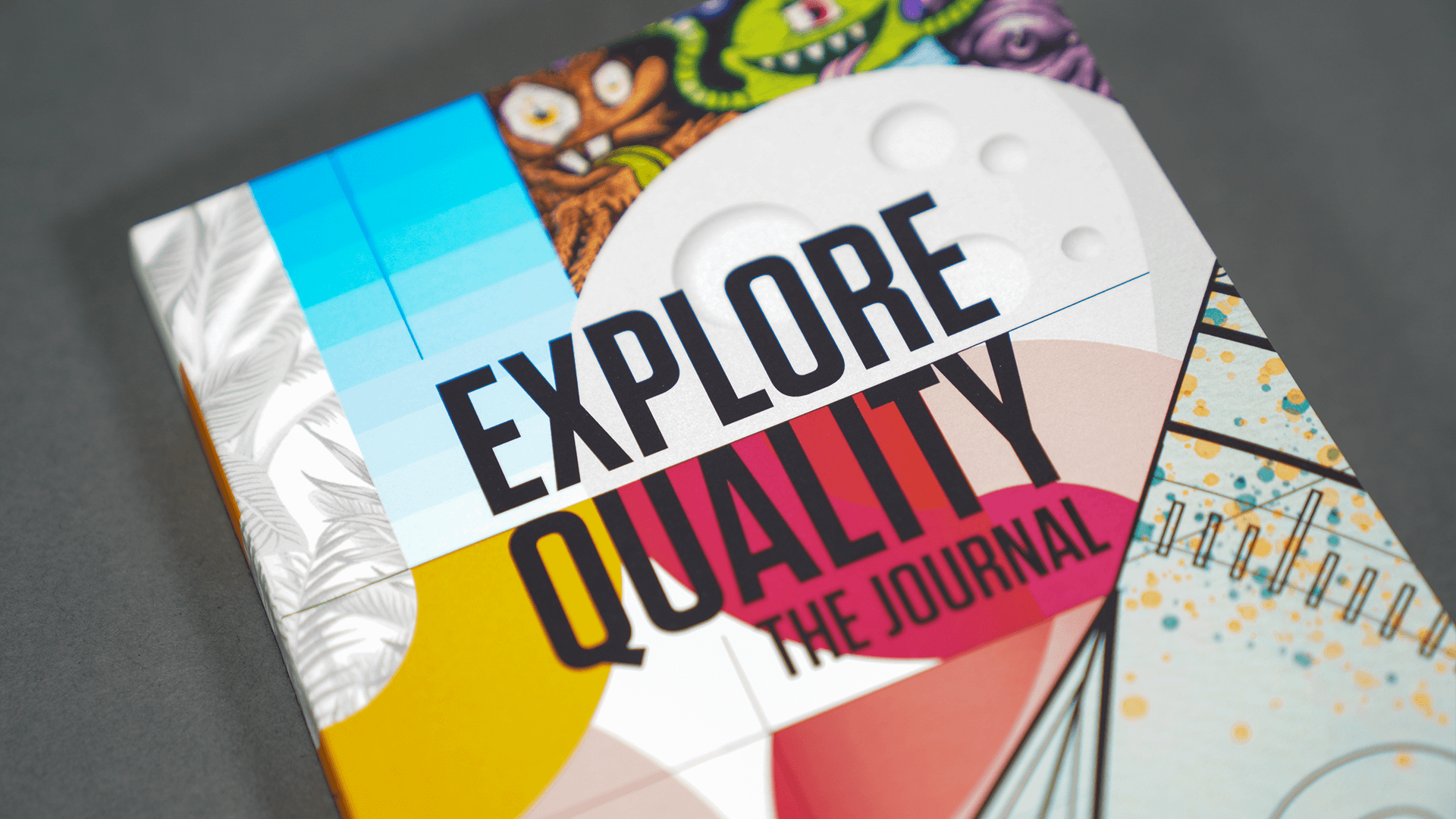
Project Spotlight: A Planner and Journal for Exploration and Discovery